
How to Create a CSS3 3D Text Spiral Animation in Your WordPress Blog
Categories: CSS, Web Development, WordPress, Animations, Beginner Tutorials
Tags: CSS3, 3D Text Animation, WordPress, Web Design, JavaScript, Animation Effects, CSS Tutorial
Introduction
In this beginner-friendly tutorial, we will explore how to create a stunning CSS3 3D Text Spiral Animation effect using four rotating words. This animation can be easily embedded into your WordPress blog to make your posts or site more interactive and engaging. With just a few lines of code, we will make some text swirl around in a 3D spiral motion.
Let’s dive in!
What You Will Learn:
- How to create the basic HTML structure
- How to style text with CSS3 animations
- How to apply a 3D perspective and create a rotating spiral effect
Step 1: HTML Structure
Let’s start by creating the HTML structure for our rotating words. We will be using a div container for each of the four words. Here’s the basic HTML:
<div class="container">
<div class="word">Design</div>
<div class="word">Develop</div>
<div class="word">Animate</div>
<div class="word">Create</div>
</div>
Here we’ve created a div container that holds four div elements with the class word that will represent the four rotating words.
Step 2: CSS for the 3D Text Spiral Effect
Now, we will add the CSS to style the text and create the spiral animation. This will involve setting up a 3D space for the animation to happen, using @keyframes to control the rotation, and applying perspective.
* {
margin: 0;
padding: 0;
box-sizing: border-box;
}
body {
font-family: Arial, sans-serif;
background: #f4f4f4;
height: 100vh;
display: flex;
justify-content: center;
align-items: center;
}
.container {
position: relative;
width: 400px;
height: 400px;
animation: rotateSpiral 10s infinite linear;
transform-style: preserve-3d;
}
.word {
position: absolute;
font-size: 40px;
color: #3498db;
font-weight: bold;
transform-origin: center;
text-align: center;
opacity: 0;
animation: fadeIn 10s infinite;
}
@keyframes rotateSpiral {
0% {
transform: rotateY(0deg) translateZ(150px);
}
25% {
transform: rotateY(90deg) translateZ(150px);
}
50% {
transform: rotateY(180deg) translateZ(150px);
}
75% {
transform: rotateY(270deg) translateZ(150px);
}
100% {
transform: rotateY(360deg) translateZ(150px);
}
}
@keyframes fadeIn {
0% {
opacity: 0;
}
25% {
opacity: 1;
}
75% {
opacity: 1;
}
100% {
opacity: 0;
}
}
Explanation:
- The
.containerclass is responsible for holding all the words. We set arotateSpiralanimation for it that rotates the entire container in a 3D space. - The
.wordclass defines the individual words and positions them absolutely inside the container. - The
rotateSpiralanimation rotates the container from 0 to 360 degrees in 3D space along the Y-axis. - The
fadeInanimation makes the words appear and disappear smoothly.
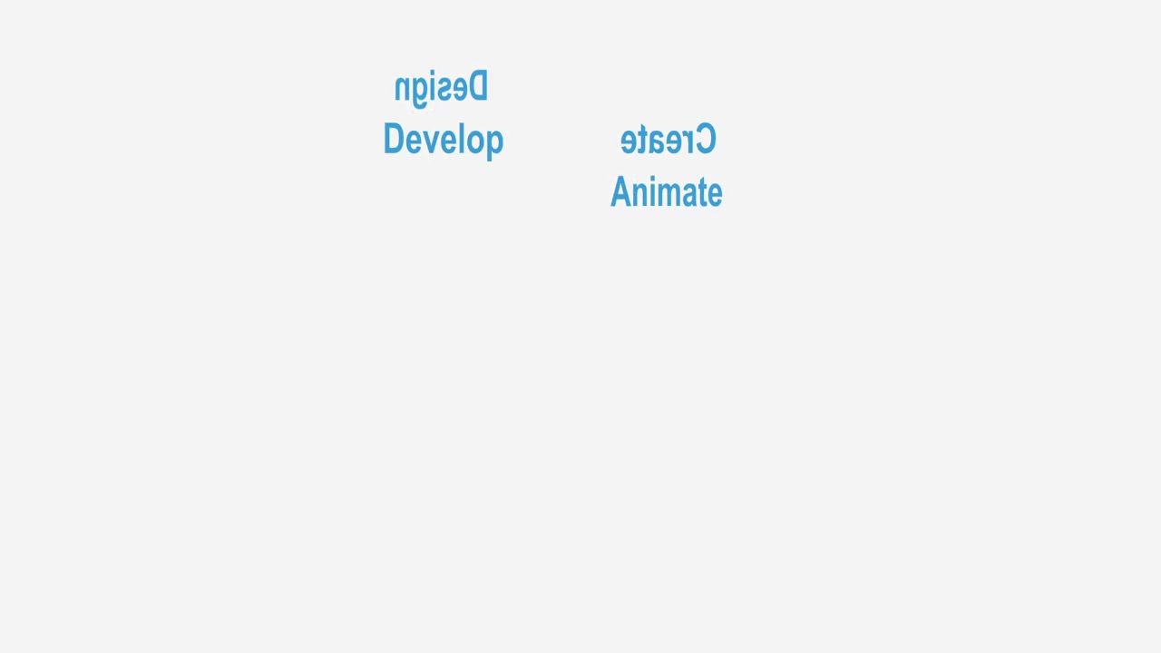
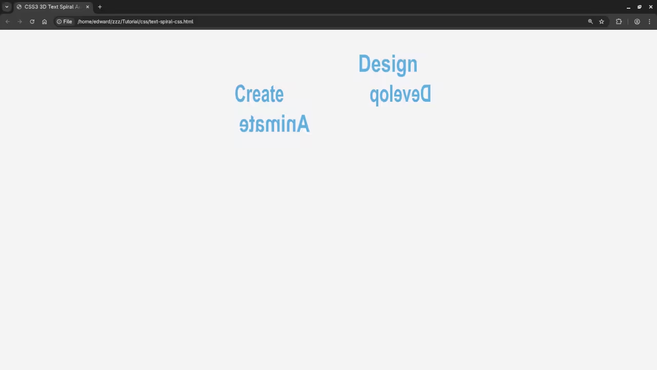
Step 3: Add Screenshots and Live Screencast
You can capture a screenshot or even create a live screencast to show the effect in action. Once you’ve created your spiral animation, take a few screenshots to highlight the rotating words in different stages.
Step 4: Final Touches
Once the animation is in place, you can customize the words, the speed of the rotation, and even the colors. The power of CSS3 allows you to create beautiful and complex animations with minimal effort.
Consolidated Demo
Screenshot
Live Screencast
Additional Resources
If you’re interested in learning more about JavaScript and other web development techniques, I have a book called Learning JavaScript, where I go over essential programming concepts for beginners.
You can also check out my Learning JavaScript Course, which is a great way to dive deeper into JavaScript and improve your coding skills.
If you need one-on-one programming tutorials, I’m available for personalized lessons. Feel free to contact me for more information.
Conclusion
I hope you found this tutorial helpful! If you have any questions, feel free to leave a comment below or reach out to me. Happy coding!
🚀 Recommended Resources
Disclosure: Some of the links above are referral links. I may earn a commission if you make a purchase at no extra cost to you.