

CSS Elastic Layout Using Em Units
Elastic layouts automatically adapt to the font used by the visitor. In Spring 2013, the default browser font size was 16px. One em is equal to the default font size.
Em is a unit of measurement for typography. One em is equal to the default font size. The default font size is set in the web browser.
This tutorial uses HTML5.
- Tools are required:
- Text editor.
- Folder for web server.
- Browser to view output.
CSS_Elastic_Layout.html File
<!--
CSS_Elastic_Layout.html
Copyright 2013 edward <http://Ojambo.com>
This program is free software; you can redistribute it and/or modify
it under the terms of the GNU General Public License as published by
the Free Software Foundation; either version 2 of the License, or
(at your option) any later version.
This program is distributed in the hope that it will be useful,
but WITHOUT ANY WARRANTY; without even the implied warranty of
MERCHANTABILITY or FITNESS FOR A PARTICULAR PURPOSE. See the
GNU General Public License for more details.
You should have received a copy of the GNU General Public License
along with this program; if not, write to the Free Software
Foundation, Inc., 51 Franklin Street, Fifth Floor, Boston,
MA 02110-1301, USA.
-->
<!DOCTYPE html>
<html xml:lang="en" lang="en">
<head>
<title>Ojambo.com Elastic Layout</title>
<meta charset="utf-8" />
<style type="text/css">
body {
font-size: 1em;
}
#container {
max-width: 75em;
margin: 0 auto;
}
#content {
float:left;
width:67%;
}
#sidebar {
float:left;
width:33%;
}
#footer {
clear:both;
}
</style>
</head>
<body>
<div id="container">
<div id="header">
<p>Header</p>
</div>
<div id="content">
<p>Main content</p>
</div>
<div id="sidebar">
<p>Sidebar</p>
</div>
<div id="footer">
<p>Footer</p>
</div>
</div>
</body>
</html>
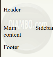
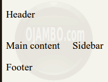
The body contents are set to 1 em which is the default font size. The container element is given a maximum width to minimize white space on large screens. The content automatically re-sizes to fit both small and large widths.
How to Use:
- Open Browser
- Make browser window smaller.
- Maker browser window larger.
Demonstration:
Ojambo.com CSS Elastic Layout Tutorial

Conclusion:
As of Spring 2013, desktop browsers use 16px as the default font size. On larger screens, users may adjust the font size to over 20px for readability. CSS elastic layouts can automatically re-size content based on the browser’s default font size.
CSS elastic layouts can be used today to accommodate both small and large screen sizes. One em is the equivalent of the default font size set in the web browser.
- Recommendations:
- Do not assume everyone will use the default font size of 16px.
- Test your layout on both small and large screens.
- Keep layouts readable on large screen by using the max-width property.
- References:
- Ojambo.com CSS Fluid Liquid Layout.
🚀 Recommended Resources
Disclosure: Some of the links above are referral links. I may earn a commission if you make a purchase at no extra cost to you.
Comments
2 responses to “CSS Elastic Layout”