

Create rounded corners with CSS
Web designers can utilize the CSS border-radius property to make rounded corners. By default, four corners are rounded is only one value is entered.
The four corners can be rounded individually by inputting values for top-left, top-right, bottom-left and bottom-right. Two values are required for horizontal and vertical radii if rounding individual corners. Different shapes can be created by using rounded corners such as circles and shadows.
This tutorial uses HTML and CSS.
- Tools are required:
- Text editor.
- Browser to view output.
Optional Download and install Geany
Geany is required in order to follow this tutorial. For more information about Geany read Ojambo.com Lightweight Programming Editors.
CSS3-Rounded-Corners.html file
<!--
CSS3-Rounded-Corners.html
Copyright 2012 Edward <http://ojambo.com>
This program is free software; you can redistribute it and/or modify
it under the terms of the GNU General Public License as published by
the Free Software Foundation; either version 2 of the License, or
(at your option) any later version.
This program is distributed in the hope that it will be useful,
but WITHOUT ANY WARRANTY; without even the implied warranty of
MERCHANTABILITY or FITNESS FOR A PARTICULAR PURPOSE. See the
GNU General Public License for more details.
You should have received a copy of the GNU General Public License
along with this program; if not, write to the Free Software
Foundation, Inc., 51 Franklin Street, Fifth Floor, Boston,
MA 02110-1301, USA.
-->
<!DOCTYPE html PUBLIC "-//W3C//DTD XHTML 1.0 Strict//EN"
"http://www.w3.org/TR/xhtml1/DTD/xhtml1-strict.dtd">
<html xmlns="http://www.w3.org/1999/xhtml" xml:lang="en" lang="en">
<head>
<title>Ojambo.com CSS3 Rounded Corners</title>
<style type="text/css">
#original_rectangle {
height: 100px;
width: 200px;
background: green;
text-align: center;
}
#rounded_rectangle {
height: 100px;
width: 200px;
background: green;
text-align: center;
border-radius: 10px;
}
#original_square {
height: 100px;
width: 100px;
background: green;
text-align: center;
}
#rounded_circle {
height: 100px;
width: 100px;
background: green;
text-align: center;
border-radius: 50px;
}
</style>
</head>
<body>
<div id="original_rectangle">rectangle</div>
<div id="rounded_rectangle">rounded rectangle</div>
<div id="original_square">square</div>
<div id="rounded_circle">circle</div>
</body>
</html>
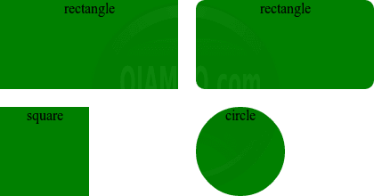
The CSS type is an internal style sheet. The styles for the id (identifiers) are defined in the head section using the style tag. The values for rounded_rectangle and rounded_circle set all for radii equally. The four radii are top-left, top-right, bottom-left and bottom-right.
How to Use:
- Open Browser
- Load test html file.
- Compare original shapes to rounded shapes.
Demonstration:
Ojambo.com CSS3 Rounded Corners Tutorial
Conclusion:
The border-radius function can be used to round corners. The rounded corners can be applied to individual corners or all corners. One possible use by designers for border radii is to create shadows.
The CSS border-radius property is turned off by default so that blocks are displayed as rectangles or squares. Border-radius is cross-browser compatible for modern browsers that support CSS3.
- Recommendations:
- Use the border-radius property for simple borders.
- If border radius are required, have a simple fall-back for incompatible browsers.
- Do not use proprietary formats such as the -moz-prefix.
🚀 Recommended Resources
Disclosure: Some of the links above are referral links. I may earn a commission if you make a purchase at no extra cost to you.
Comments
One response to “CSS3 Rounded Corners”