

HTML5 Image Gallery
Hey there, web enthusiasts! Today, we are diving into the exciting world of HTML5 and CSS3 to build a beautiful and interactive image gallery – perfect for showcasing your photos, artwork, or any visual content. Do not worry, even if you are new to web development, you will be able to follow along! This tutorial will break down the code step-by-step, so you will understand how it works.
What We will Build
We will be creating an image gallery that is:
- Visually Appealing With a clean design and subtle effects.
- Responsive Looks great on all devices (desktops, tablets, and phones).
- Interactive Features a neat hover effect to reveal image captions.
Understanding the Basics: The Code
Lets start by understanding the core of our HTML5 image gallery. Here is the code:
<h1>Interactive Photo Gallery with HTML5 & CSS3</h1>
<div class="gallery-container">
<div class="gallery-item">
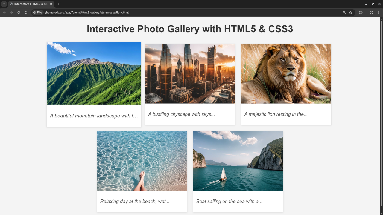
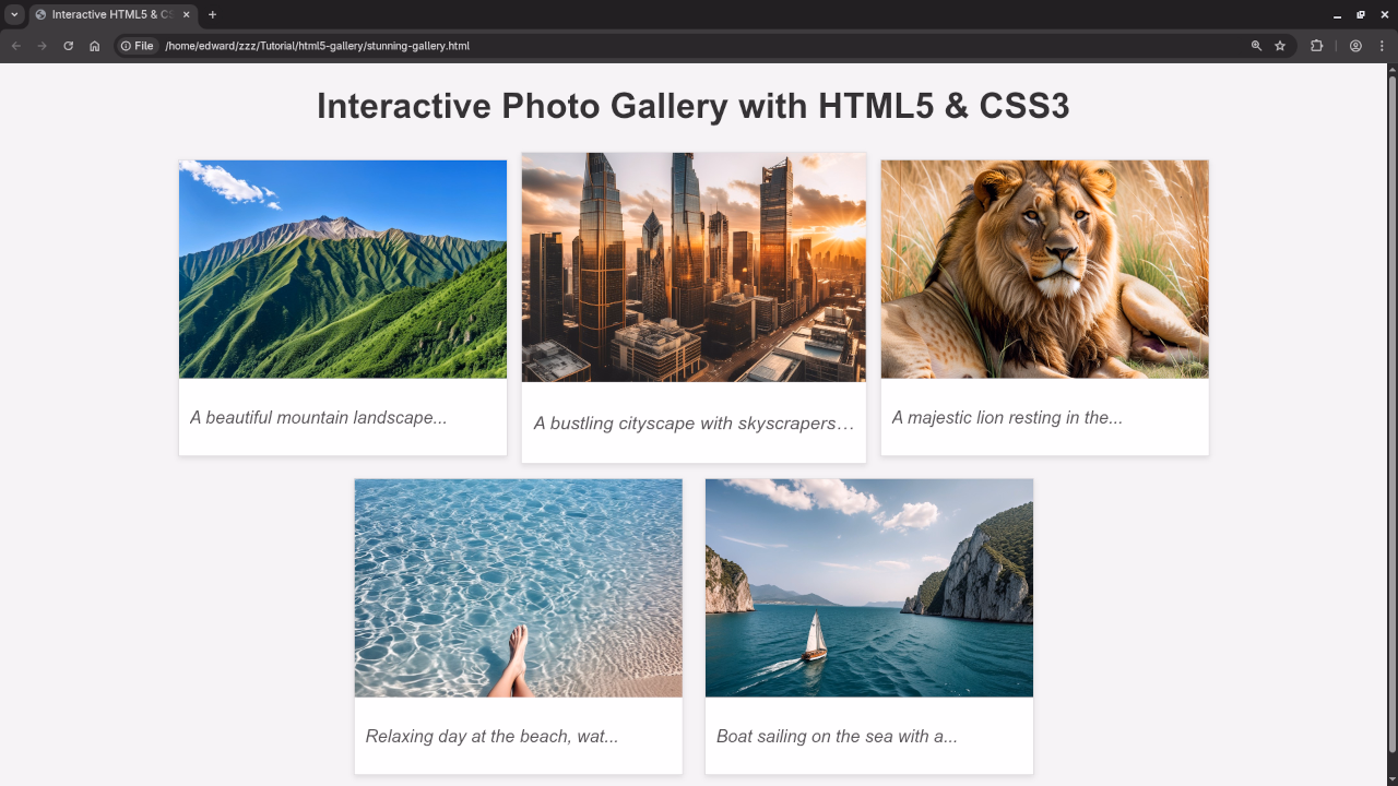
<img src="https://picsum.photos/id/1015/300/200" alt="Landscape 1">
<div class="caption-container">
<p class="caption" data-original-caption="A beautiful mountain landscape with lush greenery and a clear blue sky.">Mountain Scene</p>
</div>
</div>
<div class="gallery-item">
<img src="https://picsum.photos/id/1020/300/200" alt="Cityscape">
<div class="caption-container">
<p class="caption" data-original-caption="A bustling cityscape with skyscrapers and modern architecture, bathed in the golden light of sunset.">City at Sunset</p>
</div>
</div>
<div class="gallery-item">
<img src="https://picsum.photos/id/1025/300/200" alt="Wildlife">
<div class="caption-container">
<p class="caption" data-original-caption="A majestic lion resting in the African savanna, surrounded by tall grasses.">King of the Jungle</p>
</div>
</div>
<div class="gallery-item">
<img src="https://picsum.photos/id/1019/300/200" alt="Beach">
<div class="caption-container">
<p class="caption" data-original-caption="Relaxing day at the beach, water is clear blue.">Beach Day</p>
</div>
</div>
<div class="gallery-item">
<img src="https://picsum.photos/id/1005/300/200" alt="Boat at sea">
<div class="caption-container">
<p class="caption" data-original-caption="Boat sailing on the sea with a great landscape">Sea Boat</p>
</div>
</div>
</div>
CSS For Styling
/* Basic Styling */
body {
font-family: sans-serif;
margin: 20px;
background-color: #f4f4f4;
}
h1 {
text-align: center;
color: #333;
}
.gallery-container {
display: flex;
flex-wrap: wrap;
justify-content: center; /* Centers the gallery */
}
.gallery-item {
width: 300px;
margin: 10px;
border: 1px solid #ddd;
overflow: hidden; /* Prevents content from overflowing */
box-shadow: 0 2px 5px rgba(0, 0, 0, 0.1);
transition: transform 0.3s ease-in-out;
}
.gallery-item:hover {
transform: scale(1.05); /* Slight zoom on hover */
}
.gallery-item img {
width: 100%;
height: 200px; /* Fixed height for images */
object-fit: cover; /* Ensures images cover the area without distortion */
display: block; /* Remove any default space below the images */
}
.caption-container {
padding: 10px;
background-color: #fff;
border-top: 1px solid #eee;
}
.caption {
font-style: italic;
color: #555;
overflow: hidden;
text-overflow: ellipsis;
white-space: nowrap; /* Prevents caption from wrapping */
}
/* Responsive Design (adjust for different screen sizes) */
@media (max-width: 600px) {
.gallery-item {
width: 90%; /* Full width on smaller screens */
}
}
JavaScript For Interactivity
// JavaScript to add interactivity (optional) - for example, caption display on hover.
const galleryItems = document.querySelectorAll('.gallery-item');
galleryItems.forEach(item => {
const captionElement = item.querySelector('.caption');
const originalCaption = captionElement.getAttribute('data-original-caption');
item.addEventListener('mouseenter', () => {
// Optional: Show full caption on hover (or other interactions)
captionElement.textContent = originalCaption;
});
item.addEventListener('mouseleave', () => {
// Restore short caption on mouseout
captionElement.textContent = originalCaption.substring(0, 30) + "..."; // Or restore the ellipsis or original short caption.
});
});
Let’s Break It Down
Lets explore each piece:
- HTML Structure:
<!DOCTYPE html>: Tells the browser this is HTML5.<head>: Contains metadata about the page, such as the title and styles. The<meta>tags are very important for responsive design, making sure your website looks good on any device.<body>: This is where all the visible content of your website lives.<h1>: The main heading of our gallery.<div class="gallery-container">: This is the container for our image items. We usedisplay: flexin CSS to help us arrange our images nicely (more on that later!).<div class="gallery-item">: Each individual image and its caption are inside agallery-item.<img src="..." alt="...">: This is the image element. Thesrcattribute points to the images URL, and thealtattribute provides a description of the image (super important for accessibility and SEO!).<div class="caption-container">: Wraps the caption.<p class="caption">: This is where the images caption appears. Notice how we useddata-original-captionto store the original caption.
- CSS Styling:
- The
<style>block inside the<head>is where the magic of styling happens. CSS (Cascading Style Sheets) lets us control how our HTML elements look. .gallery-container: Uses flexbox to arrange the gallery items.flex-wrap: wrap;ensures the images wrap onto the next line on smaller screens.justify-content: center;centers the items horizontally..gallery-item: Styles each image container: adds a border, shadow, and the all-importanttransform: scale(1.05);andtransitionfor that zoom effect on hover..gallery-item img: Sets the image to cover the area and prevents distortion withobject-fit: cover;..caption: Styles the captions (italic, and adds an ellipsis if the caption is too long).@media (max-width: 600px): This is how we make our gallery responsive! It says, “When the screen is smaller than 600 pixels wide, change the width of the gallery items.” This makes the gallery adapt to smaller screens (like phones).
- The
Interactive Demo
Here’s a live example of the Stunning Gallery in action:

Adding Interactivity (JavaScript – Optional)
The <script> section contains a bit of JavaScript to add a simple hover effect. When you move your mouse over an image, the full caption appears!
Want to learn more?
This gallery is just the beginning! To truly master web development, you will want to understand the fundamentals of HTML, CSS, and JavaScript. I recommend checking out my resources:
- "Learning JavaScript" Book: I wrote a beginner-friendly book, "Learning JavaScript" available on Amazon to help you understand JavaScript fundamentals. Link to your Amazon book:
- "Learning JavaScript" Course: You can find a comprehensive course about JavaScript at Link to your course:
Need One-on-One Help?
I offer one-on-one programming tutorials, including JavaScript, to help you get personal guidance and take your skills to the next level. Contact me to schedule a session: Link to your contact page:
Conclusion
Congratulations! You have successfully built a basic image gallery using HTML5 and CSS3. You can now adapt and customize it to suit your needs. Keep experimenting, practicing, and learning! The world of web development is full of possibilities. Happy coding!
🚀 Recommended Resources
Disclosure: Some of the links above are referral links. I may earn a commission if you make a purchase at no extra cost to you.