
Introduction
We recently updated a broken 2D canvas script. This new version uses ThreeJS for better performance.
Fedora Linux users can code this in any editor. Use your favorite browser to view the final result.
The Evolution of Web Graphics
The old code failed to render real 3D depth. Modern WebGL solves this by using dedicated hardware acceleration.
We replaced manual vertex math with optimized library calls. Our new script utilizes high performance physical based materials.
Viewing the Previous Project
You can see the previous logic for comparison online. Visit https://www.ojambo.com/how-to-run-qwen2-5-coder-on-fedora-cpu-laptops to see it.
Paste the following script into your index html file. It handles the mirror logic and the 3D scene.
<script type="importmap">
{ "imports": { "three": "https://unpkg.com/three@0.160.0/build/three.module.js" } }
</script>
<script type="module">
import * as THREE from 'three';
const scene = new THREE.Scene();
const camera = new THREE.PerspectiveCamera(75, window.innerWidth / window.innerHeight, 0.1, 100);
const renderer = new THREE.WebGLRenderer({ antialias: true });
renderer.setSize(window.innerWidth, window.innerHeight);
document.body.appendChild(renderer.domElement);
const cubeRT = new THREE.WebGLCubeRenderTarget(512);
const cubeCamera = new THREE.CubeCamera(0.1, 100, cubeRT);
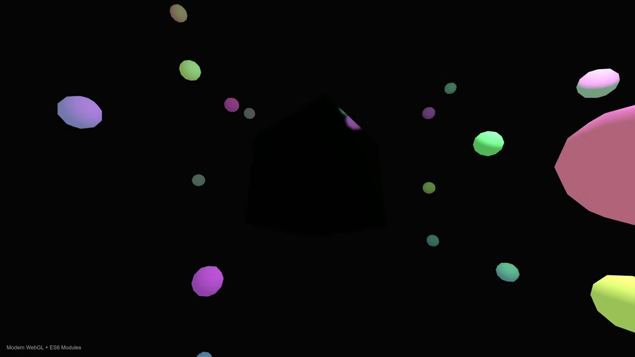
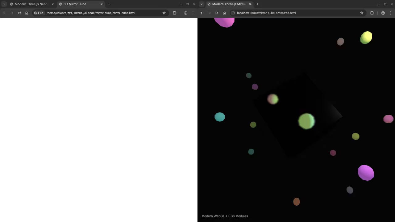
const mirrorCube = new THREE.Mesh(new THREE.BoxGeometry(2, 2, 2), new THREE.MeshStandardMaterial({ envMap: cubeRT.texture, metalness: 1, roughness: 0 }));
scene.add(mirrorCube);
const light = new THREE.PointLight(0xffffff, 50);
light.position.set(5, 5, 5);
scene.add(light, new THREE.AmbientLight(0xffffff, 0.5));
camera.position.z = 5;
function animate() {
mirrorCube.visible = false;
cubeCamera.update(renderer, scene);
mirrorCube.visible = true;
mirrorCube.rotation.x += 0.01;
renderer.render(scene, camera);
requestAnimationFrame(animate);
}
animate();
Why the CSS Cube Version Failed
The original code had three major technical errors that prevented the 3D effect from appearing correctly.
1. CSS Selector Mismatch
The stylesheet used a tag selector face { … } instead of a class selector .face { … }. This caused the browser to ignore all the styling for the cube sides because the face tag does not exist in standard HTML5.
2. Lack of Perspective
3D rotations require a perspective property on the parent container to create the illusion of depth. Without it, the cube faces rotate on a flat 2D plane and look like they are simply shrinking or stretching.
3. Missing Translation in 3D Space
Every face of the cube was sitting at the exact same center point. To form a box, each side must be pushed outward from the center using translateZ. Without this translation, the cube remains a flat stack of squares.
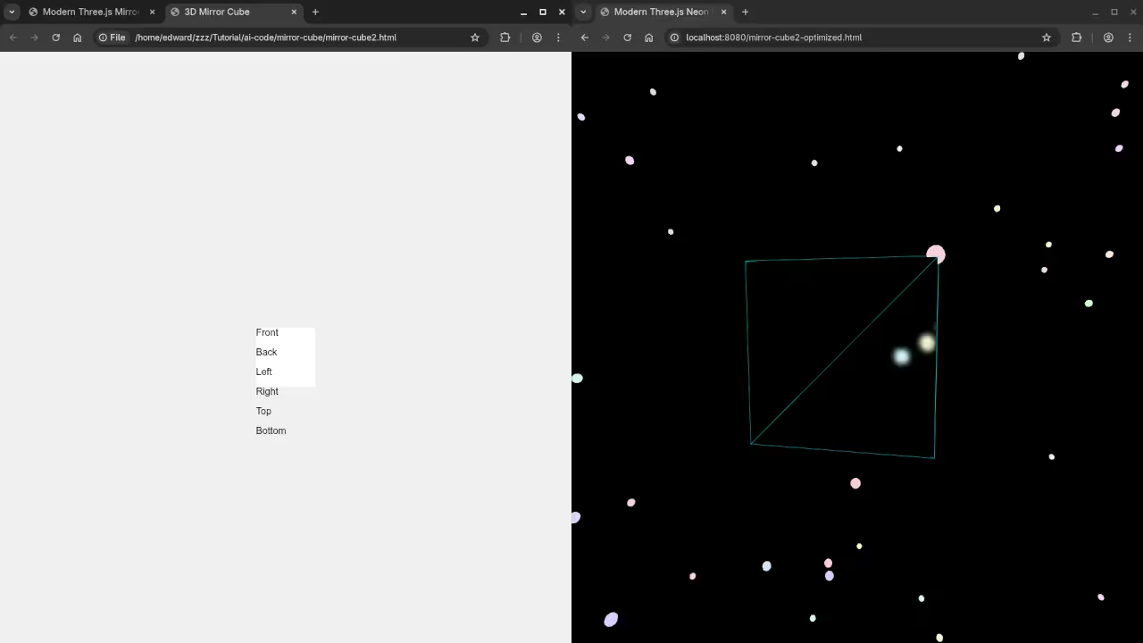
Corrected Second Version
<style>
:root { --cube-size: 100px; --half-cube: 50px; }
.scene {
width: var(--cube-size);
height: var(--cube-size);
perspective: 400px; /* Adds depth */
margin: 50px auto;
}
.cube {
width: 100%;
height: 100%;
position: relative;
transform-style: preserve-3d;
transform: rotateX(-20deg) rotateY(30deg);
transition: transform 0.5s;
}
/* Fixed: Changed 'face' to '.face' */
.face {
position: absolute;
width: var(--cube-size);
height: var(--cube-size);
border: 2px solid #333;
display: flex;
align-items: center;
justify-content: center;
font-weight: bold;
background: rgba(255, 255, 255, 0.8);
color: #333;
}
/* Fixed: Added translateZ to push faces out from center */
.front { transform: rotateY(0deg) translateZ(var(--half-cube)); }
.back { transform: rotateY(180deg) translateZ(var(--half-cube)); }
.right { transform: rotateY(90deg) translateZ(var(--half-cube)); }
.left { transform: rotateY(-90deg) translateZ(var(--half-cube)); }
.top { transform: rotateX(90deg) translateZ(var(--half-cube)); }
.bottom { transform: rotateX(-90deg) translateZ(var(--half-cube)); }
</style>
<div class="scene">
<div class="cube" id="cssCube">
<div class="face front">Front</div>
<div class="face back">Back</div>
<div class="face right">Right</div>
<div class="face left">Left</div>
<div class="face top">Top</div>
<div class="face bottom">Bottom</div>
</div>
</div>
<script>
// Simple rotation logic for the CSS cube
const cssCube = document.getElementById('cssCube');
let angle = 0;
setInterval(() => {
angle += 1;
cssCube.style.transform = `rotateX(-20deg) rotateY(${angle}deg)`;
}, 30);
</script>
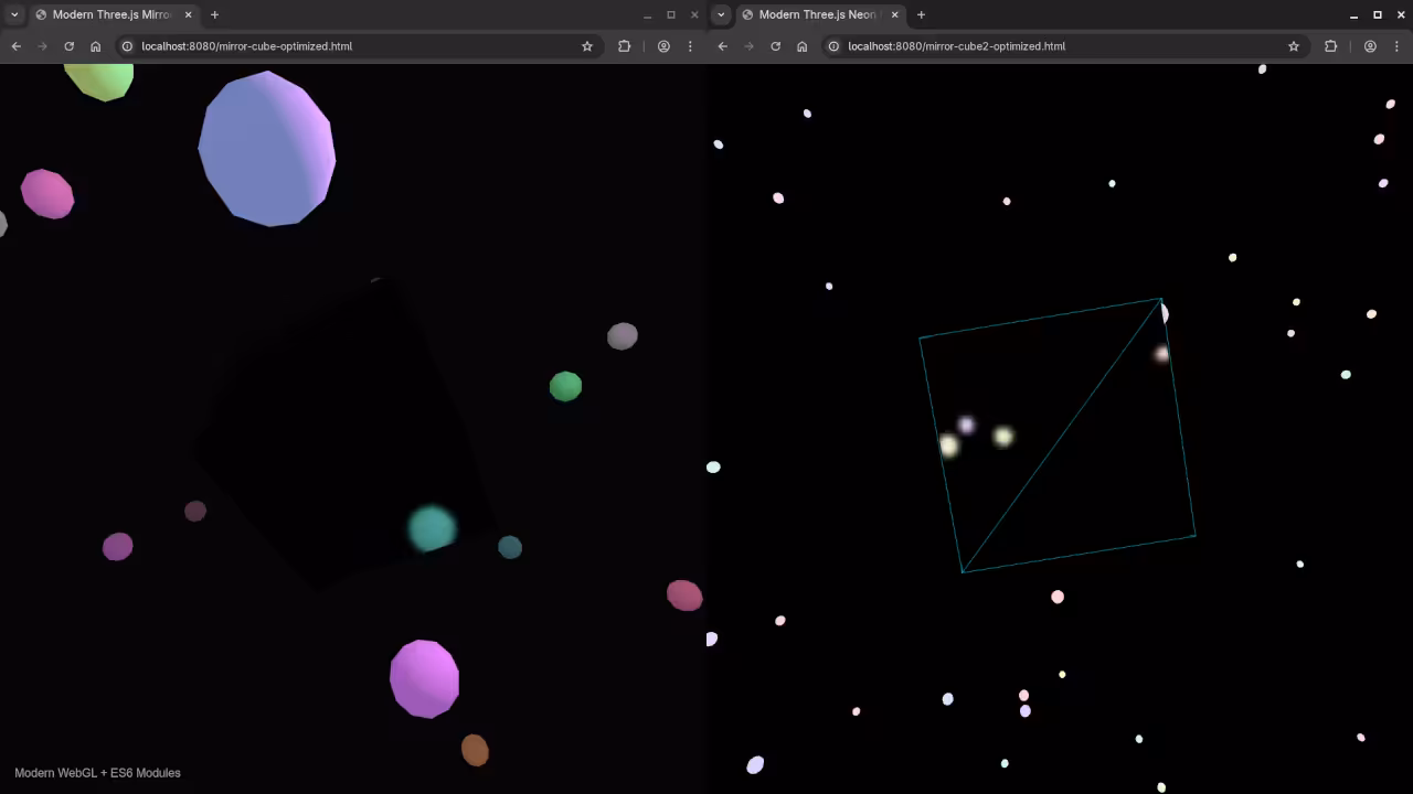
Consolidated Demo
Consolidated Demo2
Screenshot
Final Performance Results
The mirror now reflects light and surrounding objects dynamically. This creates a professional look for your web projects.
Take Your Skills Further
- Books: https://www.amazon.com/stores/Edward-Ojambo/author/B0D94QM76N
- Courses: https://ojamboshop.com/product-category/course
- Tutorials: https://ojambo.com/contact
- Consultations: https://ojamboservices.com/contact
`
🚀 Recommended Resources
Disclosure: Some of the links above are referral links. I may earn a commission if you make a purchase at no extra cost to you.