

Style pages using radial gradients
Apply radial gradients to backgrounds on your website. Modern browsers that support CSS3 will be able to view radial gradients. Gradients must have a minimum of two colours.
Radial gradients can also be created using and SVG file and embedded into HTML using tags Modern browsers that support SVG enable cross-browser compatibility.
In this tutorial, only three-colour gradients will be used .
- Tools are required:
- Text editor for creating and modifying the page hits counter files.
- SVG editor for creating gradient shapes that may be embedded.
- Web server.
- CSS.
- HTML.
- Knowledge of the files to be served.
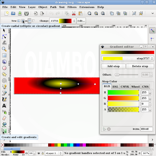
Using Inkscape to create an SVG file
- Run Inkscape:
- File -> Document Properties -> Custom size.
- Create image 400 x 50px.
- Create Rectangles and squares Tool -> create rectangle.
- Create and edit gradients Tool -> Create radial gradient.
- Edit -> Add stop.
- Change stop 1 Colour to Yellow = FFFF00.
- Change stop 2 Colour to Black = FFFFFF.
- Change stop 3 Colour to Red = FF0000.
- Save as Ojambo_RadialGradient.svg.
Index.html file
<!--
index.html
Copyright 2011 Edward <http://ojambo.com/contact>
-->
<!DOCTYPE html PUBLIC "-//W3C//DTD XHTML 1.0 Strict//EN"
"http://www.w3.org/TR/xhtml1/DTD/xhtml1-strict.dtd">
<html xmlns="http://www.w3.org/1999/xhtml" xml:lang="en" lang="en">
<head>
<title>Ojambo.com Radial Gradients Tutorial</title>
<meta http-equiv="content-type" content="text/html;charset=utf-8" />
<style type="text/css">
div#multiple-colours-radial {
height:50px;
/* Non-CSS3 browsers */
background: #999;
/* W3C Specification */
background: radial-gradient([<bg-position>,]? [[<shape> || <size>] | [<length> | <percentage>]{2} ,]? <color-stop>[, <color-stop>]+);
/* Webkit browsers */
background: -webkit-gradient(radial, center center, 0, center center, 50, color-stop(0, yellow), color-stop(0.45, #000), color-stop(1, red));
/* Mozilla browsers */
background: -moz-radial-gradient(center, yellow 0%, #000 25%, red 80%);
}
</style>
</head>
<body>
<h1>Ojambo.com Radial Gradients Tutorial</h1>
<p>Multiple colour stops radial</p>
<div id="multiple-colours-radial"></div>
<p>For Modern Broswers supporting SVG</p>
<svg
xmlns:dc="http://purl.org/dc/elements/1.1/"
xmlns:cc="http://creativecommons.org/ns#"
xmlns:rdf="http://www.w3.org/1999/02/22-rdf-syntax-ns#"
xmlns:svg="http://www.w3.org/2000/svg"
xmlns="http://www.w3.org/2000/svg"
xmlns:xlink="http://www.w3.org/1999/xlink"
xmlns:sodipodi="http://sodipodi.sourceforge.net/DTD/sodipodi-0.dtd"
xmlns:inkscape="http://www.inkscape.org/namespaces/inkscape"
width="400"
height="50"
id="svg2"
version="1.1"
inkscape:version="0.48.0 r9654"
sodipodi:docname="New document 1">
<defs
id="defs4">
<linearGradient
id="linearGradient3755">
<stop
style="stop-color:#ffff00;stop-opacity:1"
offset="0"
id="stop3757" />
<stop
id="stop3763"
offset="0.51057482"
style="stop-color:#000000;stop-opacity:1" />
<stop
style="stop-color:#ff0000;stop-opacity:1"
offset="1"
id="stop3759" />
</linearGradient>
<radialGradient
inkscape:collect="always"
xlink:href="#linearGradient3755"
id="radialGradient3761"
cx="213.61472"
cy="-169.97751"
fx="213.61472"
fy="-169.97751"
r="200"
gradientTransform="matrix(-0.00261332,0.14398508,-0.52061283,-0.00944903,55.993809,-13.547861)"
gradientUnits="userSpaceOnUse" />
</defs>
<sodipodi:namedview
id="base"
pagecolor="#ffffff"
bordercolor="#666666"
borderopacity="1.0"
inkscape:pageopacity="0.0"
inkscape:pageshadow="2"
inkscape:zoom="1.6675"
inkscape:cx="200"
inkscape:cy="25"
inkscape:document-units="px"
inkscape:current-layer="layer1"
showgrid="false"
inkscape:window-width="791"
inkscape:window-height="770"
inkscape:window-x="0"
inkscape:window-y="14"
inkscape:window-maximized="0" />
<metadata
id="metadata7">
<rdf:RDF>
<cc:Work
rdf:about="">
<dc:format>image/svg+xml</dc:format>
<dc:type
rdf:resource="http://purl.org/dc/dcmitype/StillImage" />
<dc:title></dc:title>
</cc:Work>
</rdf:RDF>
</metadata>
<g
inkscape:label="Layer 1"
inkscape:groupmode="layer"
id="layer1"
transform="translate(0,-1002.3622)">
<rect
style="color:#000000;fill:url(#radialGradient3761);fill-opacity:1;fill-rule:nonzero;stroke:none;stroke-width:15;marker:none;visibility:visible;display:inline;overflow:visible;enable-background:accumulate"
id="rect2985"
width="400"
height="50"
x="1.7991004"
y="0.22488755"
transform="translate(0,1002.3622)" />
</g>
</svg>
</body>
</html>
To generate a three colour radial gradient from center, a container called “multiple-colours-radial” is used. The height of 50px and the default background for non-CSS3 browsers are specified. For future references, the W3C specification is included. Currently only Webkit and Mozilla support the radial gradients using proprietary formats -webkit-gradient and -moz-radial-gradient respectively. For webkit browsers, definations are radial, background position, shape and size, and the colours are defined with “from” and “to”. For mozilla browsers, center indicates the position, and the first colour is defined automatically.
For modern browsers that support the SVG specifications, gradients can be created and directly embedded as text but will show up as objects. In this tutorial, Inkscape is used to create rectangular shapes which are saved as SVG files. The SVG files can be opened in any text editor and them simply pasted into HTML.
Example:
Multiple colour stops radial
For Modern Broswers supporting SVG
- Recommendations:
- Put the styles is a separate css file.
- Please note, that this works only for mozilla and webkit browsers.
- Other browsers can display gradients as images if they support SVG.
🚀 Recommended Resources
Disclosure: Some of the links above are referral links. I may earn a commission if you make a purchase at no extra cost to you.
Comments
5 responses to “CSS Radial Gradients”
hello, i need help with the css export tool on inkscape i would like to know why i can’t export my slides as css
this is what is shown
Traceback (most recent call last):
Traceback (most recent call last):
File “webslicer_export.py”, line 437, in
e.affect()
File “C:\Program Files\Inkscape\share\extensions\inkex.py”, line 215, in affect
self.effect()
File “webslicer_export.py”, line 119, in effect
error = self.validate_inputs()
File “webslicer_export.py”, line 75, in validate_inputs
self.unique_html_id( self.get_slicer_layer() )
File “webslicer_export.py”, line 96, in unique_html_id
for child in el.getchildren():
AttributeError: ‘NoneType’ object has no attribute ‘getchildren’
Hi, I have the same problem on Inkscape 0.48 on Ubuntu 12.10.
The Web -> Slicer command gives an attribute error on webslicer_export.py
‘NoneType’ object has no attribute ‘getchildren’
It would be good to have some help on this feature (maybe we should also post a bug on the inkscape project?)
For instructions on reporting Inkscape bugs, please visit their site at http://inkscape.org/report_bugs.php. You can also use SVG file directly with modern browsers.
I apologize for the late reply. You can use SVG directly in HTML or import as an image in CSS. I will create a tutorial as part of a game later using an SVG file as the background CSS.