
5+ Stunning HTML & CSS Text Animations Without JavaScript (Perfect for Beginners)
Want to bring your website to life using stunning text animations—without touching JavaScript? You’re in the right place. Below, I’ll show you 6 beginner-friendly HTML and CSS text animations, all made with just markup and style rules.
These examples are lightweight, mobile-friendly, and perfect for portfolio sites, blogs, or headers.
What You Will Learn
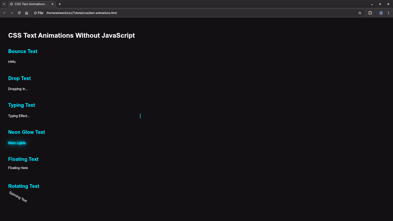
- Bouncing Text
- Dropping Text
- Typing Text
- Neon Glow Text
- Floating Text
- Rotating Text
1. Bouncing Text
HTML
<div class="bounce-text">
<span>H</span><span>e</span><span>l</span><span>l</span><span>o</span>
</div>
CSS
.bounce-text span {
display: inline-block;
animation: bounce 1s ease-in-out infinite;
}
.bounce-text span:nth-child(odd) {
animation-delay: 0.1s;
}
@keyframes bounce {
0%, 100% { transform: translateY(0); }
50% { transform: translateY(-10px); }
}
2. Dropping Text
HTML
<div class="drop-text">Dropping In...</div>
CSS
.drop-text {
animation: drop 1s ease-in-out forwards;
opacity: 0;
}
@keyframes drop {
0% {
transform: translateY(-50px);
opacity: 0;
}
100% {
transform: translateY(0);
opacity: 1;
}
}
3. Typing Text
HTML
<div class="typing-text">Typing Effect...</div>
CSS
.typing-text {
width: 0;
white-space: nowrap;
overflow: hidden;
border-right: 2px solid;
animation: typing 3s steps(20) forwards;
}
@keyframes typing {
from { width: 0 }
to { width: 100% }
}
4. Neon Glow Text
HTML
<div class="neon-text">Neon Lights</div>
CSS
.neon-text {
color: #0ff;
text-shadow:
0 0 5px #0ff,
0 0 10px #0ff,
0 0 20px #0ff,
0 0 40px #0ff;
animation: flicker 2s infinite;
}
@keyframes flicker {
0%, 19%, 21%, 23%, 25%, 54%, 56%, 100% {
opacity: 1;
}
20%, 22%, 24%, 55% {
opacity: 0.3;
}
}
5. Floating Text
HTML
<div class="float-text">Floating Here</div>
CSS
.float-text {
animation: float 3s ease-in-out infinite;
}
@keyframes float {
0%, 100% {
transform: translateY(0);
}
50% {
transform: translateY(-10px);
}
}
6. Rotating Text
HTML
<div class="rotate-text">Spinning Text</div>
CSS
.rotate-text {
display: inline-block;
animation: spin 2s linear infinite;
}
@keyframes spin {
from {
transform: rotate(0deg);
}
to {
transform: rotate(360deg);
}
}
Consolidated Demo
Screenshot
Live Screencast
Need One-on-One Help?
I offer personal programming tutorials and professional help with installing, updating, or migrating HTML5 Applications.
Get in touch: https://ojambo.com/contact
Final Thoughts
CSS-only animations are lightweight, elegant, and easy to implement. From hover effects to animated headers, you can do a lot without touching JavaScript. Start simple, experiment often, and always test for responsiveness and accessibility.
Which animation would you like a deeper tutorial on? Let me know!
🚀 Recommended Resources
Disclosure: Some of the links above are referral links. I may earn a commission if you make a purchase at no extra cost to you.