
Looking for a fun and beginner-friendly way to practice HTML5 and CSS3? In this post, we’ll build a set of rotating playing cards using just HTML and CSS — no JavaScript or libraries required!
You'll learn how to:
- Use HTML entities for suit symbols (♥ ♦ ♣ ♠)
- Style cards to look like a real deck
- Apply 3D transforms to make them flip on hover
- Create a simple stacked house-of-cards layout
Perfect for beginners who want to explore 3D effects and CSS transitions.
* {
box-sizing: border-box;
margin: 0;
padding: 0;
}
body {
background: #0b0b0b;
height: 100vh;
display: flex;
align-items: center;
justify-content: center;
perspective: 1200px;
font-family: 'Georgia', serif;
}
.house {
display: flex;
flex-direction: column;
align-items: center;
gap: 30px;
transform-style: preserve-3d;
transform: rotateX(10deg) rotateY(10deg);
}
.row {
display: flex;
gap: 20px;
transform-style: preserve-3d;
}
.card {
width: 120px;
height: 180px;
perspective: 1000px;
}
.card-inner {
position: relative;
width: 100%;
height: 100%;
transform-style: preserve-3d;
transition: transform 0.8s;
}
.card:hover .card-inner {
transform: rotateY(180deg);
}
.card-face {
position: absolute;
width: 100%;
height: 100%;
backface-visibility: hidden;
border-radius: 10px;
border: 2px solid #000;
background: white;
display: flex;
flex-direction: column;
justify-content: space-between;
padding: 10px;
box-shadow: 0 5px 15px rgba(0,0,0,0.4);
}
.card-back {
background: repeating-linear-gradient(45deg, #333 0, #333 5px, #555 5px, #555 10px);
color: white;
transform: rotateY(180deg);
justify-content: center;
align-items: center;
font-size: 24px;
}
.corner {
font-size: 18px;
line-height: 1;
}
.corner.top {
align-self: flex-start;
}
.corner.bottom {
align-self: flex-end;
transform: rotate(180deg);
}
.suit {
font-size: 36px;
text-align: center;
flex-grow: 1;
display: flex;
align-items: center;
justify-content: center;
}
/* Suit Colors */
.red {
color: #d40000;
}
.black {
color: #000;
}
<div class="house">
<div class="row">
<div class="card">
<div class="card-inner">
<div class="card-face">
<div class="corner top red">A<br>&hearts;</div>
<div class="suit red">&hearts;</div>
<div class="corner bottom red">A<br>&hearts;</div>
</div>
<div class="card-face card-back">CARD</div>
</div>
</div>
<div class="card">
<div class="card-inner">
<div class="card-face">
<div class="corner top black">K<br>&clubs;</div>
<div class="suit black">&clubs;</div>
<div class="corner bottom black">K<br>&clubs;</div>
</div>
<div class="card-face card-back">CARD</div>
</div>
</div>
<div class="card">
<div class="card-inner">
<div class="card-face">
<div class="corner top red">Q<br>&diams;</div>
<div class="suit red">&diams;</div>
<div class="corner bottom red">Q<br>&diams;</div>
</div>
<div class="card-face card-back">CARD</div>
</div>
</div>
</div>
<div class="row">
<div class="card">
<div class="card-inner">
<div class="card-face">
<div class="corner top black">J<br>&spades;</div>
<div class="suit black">&spades;</div>
<div class="corner bottom black">J<br>&spades;</div>
</div>
<div class="card-face card-back">CARD</div>
</div>
</div>
<div class="card">
<div class="card-inner">
<div class="card-face">
<div class="corner top red">10<br>&hearts;</div>
<div class="suit red">&hearts;</div>
<div class="corner bottom red">10<br>&hearts;</div>
</div>
<div class="card-face card-back">CARD</div>
</div>
</div>
</div>
<div class="row">
<div class="card">
<div class="card-inner">
<div class="card-face">
<div class="corner top black">9<br>&spades;</div>
<div class="suit black">&spades;</div>
<div class="corner bottom black">9<br>&spades;</div>
</div>
<div class="card-face card-back">CARD</div>
</div>
</div>
</div>
</div>
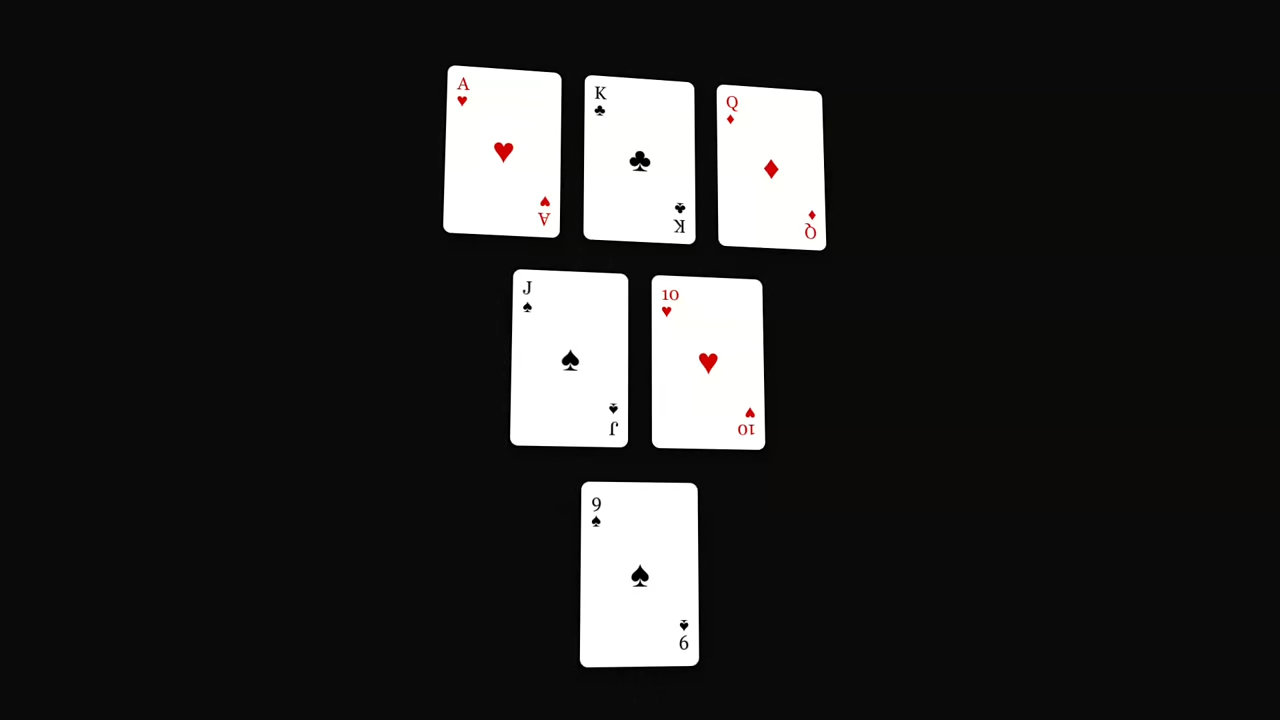
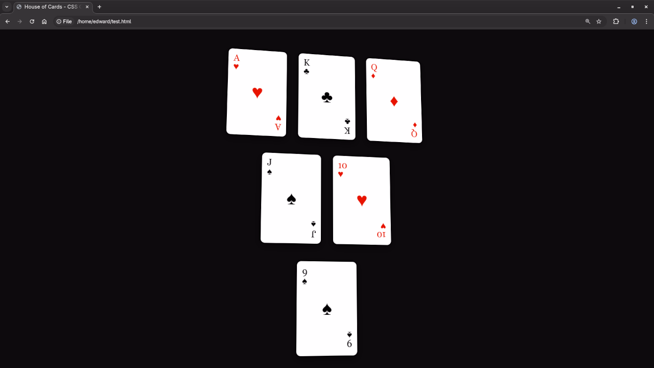
🃏 What You'll Build
Screenshot
🎥 Screencast
⚙️ How It Works
The core concept relies on HTML structure for each card, and CSS 3D transforms to rotate the card on hover. Each card has:
- A front face with suit and value
- A back face with a patterned background
- Smooth flipping animation using
transform: rotateY(180deg);
The layout uses CSS Flexbox to arrange cards in rows like a stacked house of cards.
📚 Want to Learn More JavaScript?
This project doesn’t use JavaScript, but if you’re ready to take your coding to the next level, check out my book:
📖 Learning JavaScript – A beginner-friendly guide to mastering JavaScript fundamentals.
Or enroll in my full video course:
🎓 Learning JavaScript (Online Course) – A hands-on course designed to build your skills from the ground up.
👩💻 Need Help? Book a 1-on-1 Session
I'm also available for one-on-one programming tutorials, including:
- JavaScript
- HTML/CSS
- Front-End Projects
✅ Conclusion
This simple rotating playing card project is a great way to understand how HTML5 and CSS3 can create interactive, animated UIs without JavaScript.
Ready to dive deeper? Try converting these cards into a full card game layout using JS in your next project!
Let me know in the comments if you tried this out, and don’t forget to subscribe for more tutorials!
🚀 Recommended Resources
Disclosure: Some of the links above are referral links. I may earn a commission if you make a purchase at no extra cost to you.