
Want to add some ✨ spark to your website or just have fun with Tailwind CSS animations? In this beginner-friendly tutorial, we’ll build a rocket launch loop animation using just HTML + Tailwind CSS — no JavaScript needed!
This is a perfect starter project for those learning front-end design, and it’s completely customizable.
🚀 What You’ll Learn
- How to use Tailwind CSS utility classes for layout and animation
- Create pure CSS animations (no JavaScript required)
- Build a looping rocket launch effect with smoke and stars
📚 Continue Learning JavaScript
Interested in learning more than just styling? Check out my beginner-level book and course:
👨🎓 Want Personal Help?
I also offer one-on-one programming tutorials — including HTML, CSS, and JavaScript.
💬 Contact me here to schedule a session »
🔧 The Code (HTML + Tailwind)
Below is the actual code used to make the rocket launch animation. It’s fully responsive and requires no JavaScript for the animation loop.
<!DOCTYPE html>
<html lang="en">
<head>
<meta charset="UTF-8" />
<meta name="viewport" content="width=device-width, initial-scale=1.0" />
<title>CSS Rocket Launch Loop</title>
<script src="https://cdn.tailwindcss.com"></script>
<style>
/* Background */
body {
background: radial-gradient(circle, #0a0a0a 0%, #000000 100%);
overflow: hidden;
}
/* Stars */
.star {
position: absolute;
width: 2px;
height: 2px;
background: white;
opacity: 0.8;
border-radius: 50%;
animation: twinkle 2s infinite ease-in-out;
}
@keyframes twinkle {
0%, 100% { opacity: 0.2; }
50% { opacity: 1; }
}
/* Smoke Puff */
@keyframes smokePuff {
0% { opacity: 0.5; transform: translateY(0) scale(1); }
100% { opacity: 0; transform: translateY(30px) scale(2); }
}
.smoke1 { animation: smokePuff 2s ease-out infinite; animation-delay: 0s; }
.smoke2 { animation: smokePuff 2s ease-out infinite; animation-delay: 0.3s; }
.smoke3 { animation: smokePuff 2s ease-out infinite; animation-delay: 0.6s; }
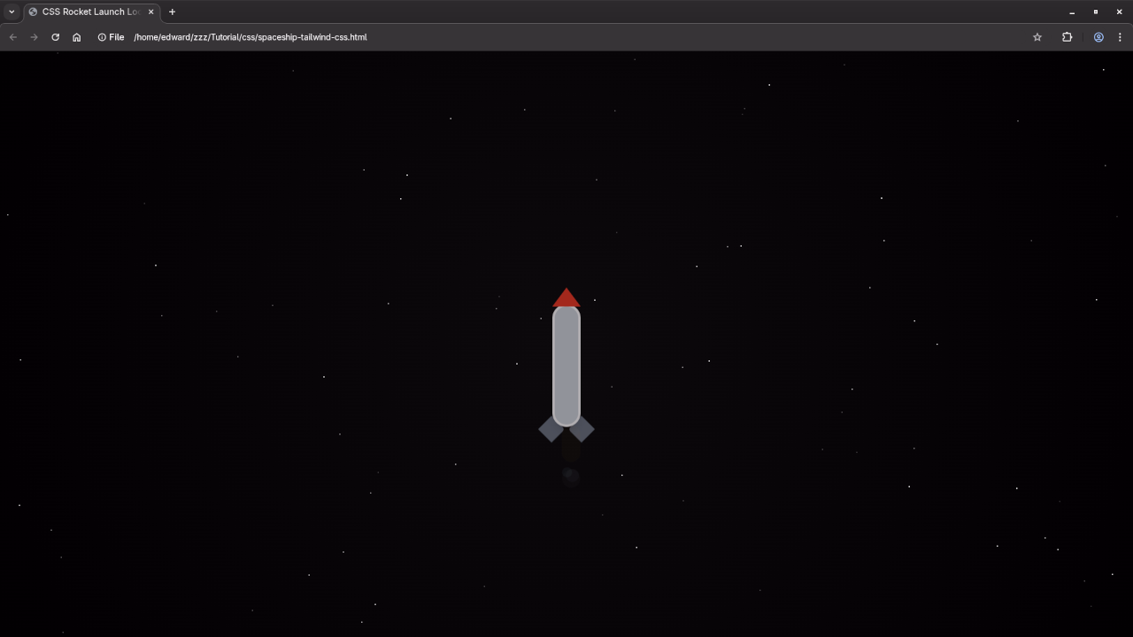
/* Rocket Launch Loop */
@keyframes launchLoop {
0% { transform: translateY(0); opacity: 1; }
10% { transform: translateY(-10px); }
90% { transform: translateY(-120vh); opacity: 0; }
100% { transform: translateY(0); opacity: 1; }
}
.launch-loop {
animation: launchLoop 10s ease-in-out infinite;
}
/* Countdown shows only during first cycle */
@keyframes countdownFade {
0% { opacity: 1; }
60% { opacity: 1; }
100% { opacity: 0; visibility: hidden; }
}
.countdown {
animation: countdownFade 10s ease forwards;
animation-iteration-count: 1;
}
</style>
</head>
<body class="relative flex flex-col items-center justify-end min-h-screen text-white font-mono">
<!-- Stars (optional: can be static with divs instead of JS) -->
<script>
for (let i = 0; i < 80; i++) {
const star = document.createElement('div');
star.classList.add('star');
star.style.top = `${Math.random() * 100}vh`;
star.style.left = `${Math.random() * 100}vw`;
star.style.animationDuration = `${1 + Math.random() * 2}s`;
document.body.appendChild(star);
}
</script>
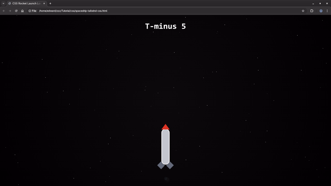
<!-- Countdown (only shows during first launch) -->
<div class="absolute top-10 text-5xl font-bold countdown">
T-minus 5
</div>
<!-- Rocket -->
<div class="relative w-24 h-72 mb-10 launch-loop">
<!-- Smoke -->
<div class="absolute bottom-0 left-1/2 -translate-x-1/2">
<div class="w-4 h-4 bg-gray-400 rounded-full opacity-50 smoke1 absolute"></div>
<div class="w-3 h-3 bg-gray-500 rounded-full opacity-50 smoke2 absolute left-1"></div>
<div class="w-2.5 h-2.5 bg-gray-600 rounded-full opacity-50 smoke3 absolute -left-1"></div>
</div>
<!-- Flame -->
<div class="absolute bottom-2 left-1/2 -translate-x-1/2 w-4 h-8 bg-yellow-400 animate-ping rounded-full shadow-lg z-10"></div>
<!-- Rocket Body -->
<div class="absolute top-7 left-1/2 -translate-x-1/2 w-12 h-[13rem] bg-gray-300 rounded-t-full rounded-b-full border-4 border-white shadow-lg z-10"></div>
<!-- Nose -->
<div class="absolute top-0 left-1/2 -translate-x-1/2 w-0 h-0
border-l-[24px] border-r-[24px] border-b-[32px]
border-l-transparent border-r-transparent border-b-red-600 z-10"></div>
<!-- Wings -->
<div class="absolute bottom-12 left-0 w-8 h-8 bg-gray-500 rotate-45 origin-bottom-left rounded-tr-md z-0"></div>
<div class="absolute bottom-12 right-0 w-8 h-8 bg-gray-500 -rotate-45 origin-bottom-right rounded-tl-md z-0"></div>
</div>
</body>
</html>
You can copy and paste this into your HTML file and customize it however you like.
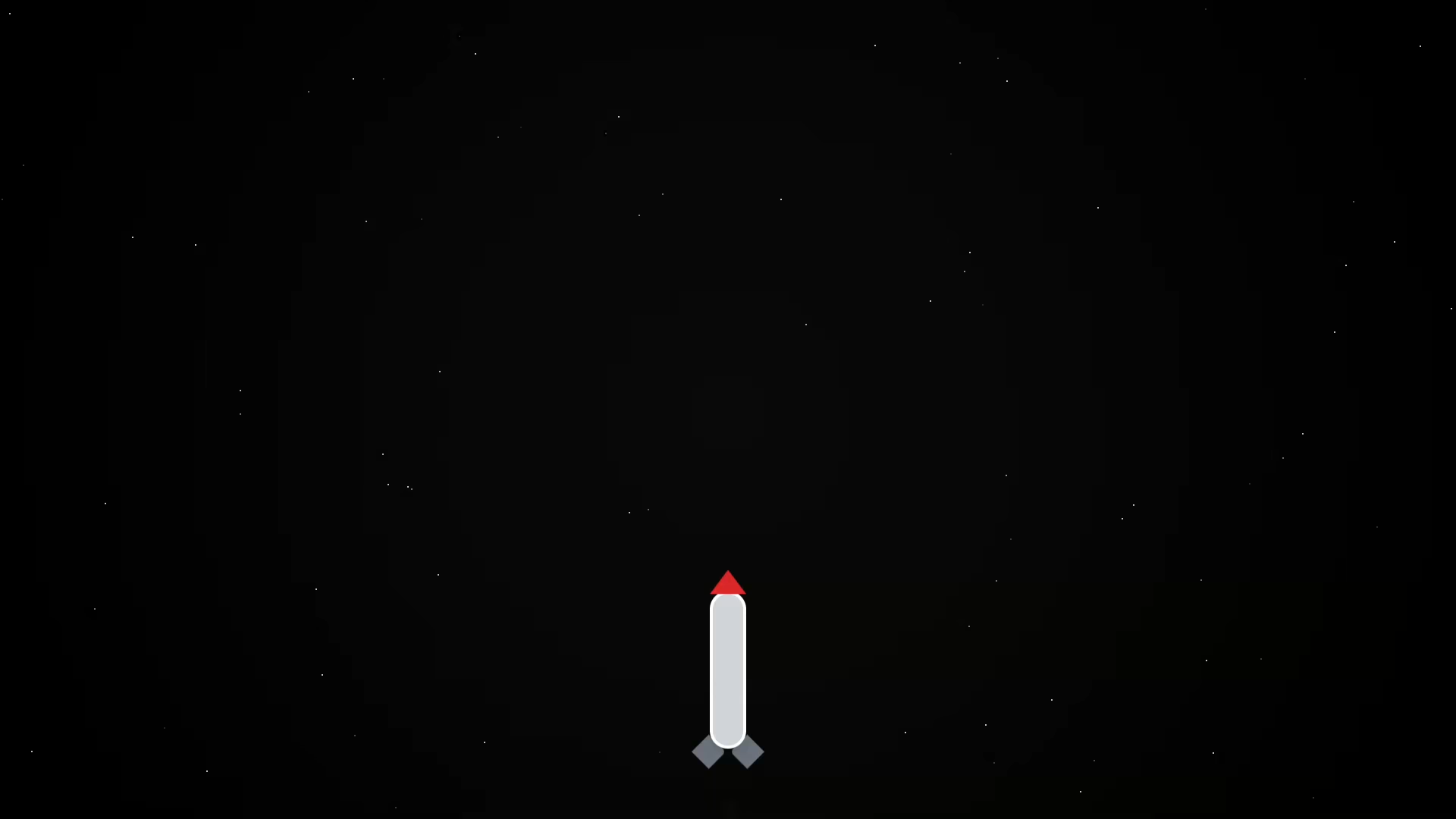
Interactive Demo
Here’s a live example of the Rocket Launch in action:
🎬 Watch It
🌌 What’s Next?
- Try adding parallax backgrounds or sound effects
- Use this as an intro screen or background for your site
- Customize the rocket to match your branding
🧠 Summary
This rocket launch animation is a fun, visual way to learn CSS animation using Tailwind. Whether you’re building a space-themed site or learning front-end techniques, this is a great project to add to your portfolio.
🚀 Happy launching!
🚀 Recommended Resources
Disclosure: Some of the links above are referral links. I may earn a commission if you make a purchase at no extra cost to you.